How to Add Secondary Axis in Excel: Expert Tips and Complete Guide
Excel’s charting capabilities are powerful tools for data visualization, but sometimes a single axis simply isn’t enough. When you’re working with datasets that have vastly different scales or units, a secondary axis becomes essential for creating meaningful, readable charts. Whether you’re comparing sales revenue against customer count or temperature against humidity levels, understanding how to add a secondary axis in Excel will transform your data presentation and make complex relationships instantly clear to your audience.
A secondary axis allows you to plot two different data series with different scales on the same chart, preventing one dataset from dominating the visual while the other becomes nearly invisible. This technique is invaluable in business analytics, scientific research, financial reporting, and project management. In this comprehensive guide, we’ll walk you through every method to add a secondary axis, troubleshoot common issues, and explore advanced formatting options that will elevate your Excel charting skills.
Understanding Secondary Axes in Excel
Before diving into the technical steps, it’s crucial to understand when and why you’d use a secondary axis. A secondary axis is a duplicate axis that appears on the opposite side of your chart (typically the right side for the Y-axis). It operates independently from the primary axis, allowing different data series to have completely different scales.
Consider a practical example: imagine tracking monthly website traffic (measured in thousands of visitors) alongside marketing spend (measured in hundreds of dollars). If both used the same axis scale, the marketing spend line would appear as a nearly flat line at the bottom of the chart, making trends impossible to discern. By assigning marketing spend to a secondary axis with its own scale, both datasets become equally visible and analyzable.
The primary axis (left side) and secondary axis (right side) can have different minimum values, maximum values, and units. This independence is what makes secondary axes so powerful for comparative analysis. Learn more about data visualization techniques to enhance your presentation skills.
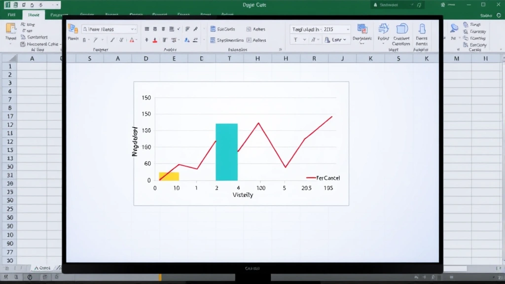
[IMAGE_1]
Step-by-Step Guide to Adding a Secondary Axis
Method 1: Using the Format Data Series Dialog
This is the most straightforward method for adding a secondary axis in Excel. Follow these steps carefully:
- Create your chart first. Select your data range including headers, then insert a chart using the Insert menu. Choose your preferred chart type (column, line, or combination charts work best with secondary axes).
- Click on the data series you want to move. Once your chart is inserted, click directly on the data series line or bars that should appear on the secondary axis. You’ll see small square handles appear around that specific series.
- Right-click and select Format Data Series. A dialog box will open with various formatting options. Look for the “Series Options” or “Axis” section.
- Choose Secondary Axis. Within the dialog, locate the option that says “Plot Series On” or “Secondary Axis” and select it. Click OK to apply the changes.
- Verify the change. Your selected data series should now plot against a new axis on the right side of your chart, and a secondary axis scale should appear on the right edge.
Method 2: Using the Chart Design Tab
Excel 2013 and later versions offer a more visual approach through the Chart Design ribbon:
- Select your chart by clicking on it. The Chart Tools menu will appear in the ribbon.
- Navigate to Chart Design tab. Look for options related to chart type or data series.
- Right-click the data series you want to move to the secondary axis.
- Select Change Series Chart Type. This opens a dialog where you can assign the series to a secondary axis while optionally changing its chart type.
- Apply your changes. This method is particularly useful if you want different chart types for different series (like combining a column chart with a line chart).
Method 3: Quick Method for Combination Charts
If you’re creating a new chart from scratch, you can build in the secondary axis from the beginning:
- Select all your data including multiple columns you want to chart.
- Insert a Recommended Chart. Excel will suggest chart combinations that work well with your data.
- Choose a combination chart type that includes a secondary axis option.
- Excel automatically assigns different series to different axes, saving you several steps.

Formatting Your Secondary Axis
Once you’ve added your secondary axis, formatting it properly ensures clarity and professional appearance. Understanding how to manage multiple elements simultaneously helps with complex projects.
Adjusting Axis Scales
The secondary axis automatically scales to fit your data, but you may want to adjust it:
- Right-click the secondary axis (the numbers on the right side of your chart)
- Select Format Axis to open the formatting pane
- Adjust Minimum and Maximum values to control the range displayed
- Change Major Units to control interval spacing between tick marks
- Set Number Format to match your data (currency, percentage, decimal places, etc.)
Adding Axis Titles
Clear axis titles prevent confusion about what each axis represents:
- Click on your chart to select it
- Go to Chart Elements (usually in the Design tab)
- Check the “Axis Titles” option
- Click on the secondary axis title that appears
- Type a descriptive title (e.g., “Marketing Budget ($)” or “Customer Count”)
- Format the text with appropriate font size and color for visibility
Color-Coding for Clarity
Professional charts use color to reinforce the connection between data series and their axes:
- Format the secondary axis numbers to match the color of the data series it represents
- Use the same color for the axis title and the data series line or bars
- Ensure sufficient contrast between primary and secondary axis elements
- Avoid using colors that are difficult to distinguish for colorblind viewers
Advanced Techniques and Best Practices
Combining Different Chart Types
One of the most powerful uses of secondary axes is combining different chart types. For example, you might display one data series as columns (representing actual values) and another as a line (representing trends or percentages). This combination:
- Makes different data characteristics immediately apparent
- Allows viewers to process multiple types of information simultaneously
- Creates more engaging and professional-looking reports
- Helps highlight relationships between different metrics
To create a combination chart, use the “Change Series Chart Type” option available when you right-click a data series on the secondary axis.
Working with Percentage and Absolute Value Data
Secondary axes excel at comparing metrics with completely different units. A common scenario involves plotting actual sales figures against growth percentage. The secondary axis lets the percentage line maintain visibility despite the much larger scale of the absolute sales numbers. This approach is particularly valuable in financial analysis and project planning where you need to track multiple performance indicators simultaneously.
Creating Dual-Axis Time Series Charts
When comparing trends over time with different scales, secondary axes are essential. For instance, tracking both daily temperature and daily sales over a month requires different axis scales. The secondary axis ensures that seasonal patterns in both datasets remain visible and analyzable, rather than one overshadowing the other.
Legend Management
With multiple axes and potentially different chart types, your legend becomes more important:
- Ensure your legend clearly identifies which series uses which axis
- Consider adding parenthetical notes like “(Primary Axis)” and “(Secondary Axis)”
- Position the legend where it doesn’t obscure important data points
- Use consistent naming conventions that match your axis titles
Data Label Best Practices
When using secondary axes, data labels require careful consideration:
- Use data labels sparingly to avoid cluttering your chart
- Consider showing labels only for key data points
- Ensure labels don’t overlap with axis titles or other elements
- Include units in labels when not obvious from the axis title
Troubleshooting Common Issues
Secondary Axis Not Appearing
If your secondary axis doesn’t appear after following the steps, verify that:
- You’ve selected the correct data series (click directly on the line or bars, not the chart background)
- Your chart type supports secondary axes (most do, but some specialized charts don’t)
- You’re using a compatible Excel version (secondary axes are available in Excel 2007 and later)
- The data series actually has different scale requirements from your primary axis data
Axis Scales Creating Misleading Visualizations
Secondary axes can sometimes be misused to create misleading charts. To avoid this:
- Ensure your axis ranges make logical sense for your data
- Avoid manipulating scales to exaggerate minor differences
- Include both axis labels and a clear legend to prevent misinterpretation
- Consider your audience’s familiarity with dual-axis charts
- Document your methodology and axis ranges in accompanying text
Overlapping Elements
With two axes and potentially four labels (two axis titles, two axis scales), overlapping can occur:
- Increase your chart size to provide more space
- Adjust font sizes of axis labels and titles
- Reposition legend and axis titles to less congested areas
- Use abbreviated labels if full names are too long
- Consider rotating axis labels 45 degrees for better spacing
Exporting and Printing Issues
Secondary axes can sometimes behave unexpectedly when exporting to PDF or printing:
- Preview your chart in print layout before finalizing
- Test PDF export to ensure all elements display correctly
- Verify that colors are distinguishable in grayscale printing
- Check that secondary axis labels don’t get cut off at chart edges
- Consider creating a high-resolution image export for presentations
For more information on managing complex data visualization, explore how to organize and present information effectively.
FAQ
Can I have more than two axes in an Excel chart?
Excel natively supports only two axes: primary and secondary. If you need to compare more than two datasets with different scales, consider creating multiple charts or using advanced visualization techniques like small multiples (separate mini-charts for each dataset).
What’s the difference between a secondary axis and a secondary Y-axis?
In most Excel contexts, these terms are used interchangeably. A secondary Y-axis is indeed a secondary axis. Excel also supports secondary X-axes in certain chart types, though this is less common and typically used in specialized scientific applications.
Should I always use a secondary axis when data scales differ?
Not necessarily. Sometimes rescaling your data, using logarithmic scales, or creating separate charts is more appropriate. Secondary axes work best when you want to show the relationship between two metrics with different units or scales while maintaining their independent identity.
How do I remove a secondary axis after adding it?
Right-click the secondary axis numbers on the right side of your chart, select “Delete Axis,” or right-click the data series and reassign it to the primary axis through the Format Data Series dialog.
Can I use secondary axes in Excel charts on mobile devices?
Yes, secondary axes are supported in Excel for mobile apps, though the interface for creating and editing them is simplified. Desktop Excel provides more comprehensive formatting options.
What external resources help with Excel charting?
The Microsoft Office Support Center provides official documentation. Additionally, Excel-Easy offers practical tutorials, and Contextures specializes in advanced charting techniques. For data visualization best practices, consult Interaction Design Foundation’s data visualization resources.
Are there limitations to secondary axis usage?
Yes, some limitations include: certain chart types don’t support secondary axes, having more than two datasets with different scales requires multiple charts, and secondary axes can sometimes make charts harder to interpret if not clearly labeled. Always prioritize clarity and honesty in data representation over visual complexity.
Mastering secondary axes significantly enhances your Excel charting capabilities, enabling you to present complex, multi-dimensional data in clear, compelling ways. Whether you’re preparing business reports, academic research, or financial analyses, these techniques will help you communicate your insights more effectively to any audience.