Add Text in Premiere Pro: Editor’s Guide
Adobe Premiere Pro stands as one of the most powerful video editing platforms available to both professionals and DIY enthusiasts. Whether you’re creating tutorial videos, promotional content, or personal projects, adding text is one of the most essential skills you’ll master. Text overlays can transform your videos by providing context, emphasizing key points, and engaging your audience with visual information that complements your footage.
Unlike many other video editing tasks that require specialized equipment or construction knowledge similar to DIY home security installation, adding text in Premiere Pro is entirely software-based and accessible to anyone willing to learn the fundamentals. This guide will walk you through every method of inserting and customizing text, from basic title creation to advanced effects that make your projects stand out.
Understanding the Text Tools in Premiere Pro
Premiere Pro offers multiple pathways for adding text to your projects, each with distinct advantages depending on your workflow and creative goals. The primary method involves using the Essential Graphics panel, which represents Adobe’s modern approach to text and graphic creation within the timeline. This panel provides real-time preview capabilities and integrates seamlessly with your video editing workflow.
The Type tool, accessed from the toolbox on the left side of your interface, allows you to click directly on your video canvas and begin typing. This approach is straightforward for simple text additions but offers less control over positioning compared to other methods. Understanding which tool serves your specific purpose will significantly accelerate your editing process and improve your final output quality.
Premiere Pro also maintains support for legacy title creation through the Title panel, though Adobe has gradually shifted focus toward the Essential Graphics panel in recent versions. Both methods remain viable, but the Essential Graphics approach offers superior integration with modern design principles and responsive templates that adapt to different aspect ratios and resolutions.
When you’re working on projects similar to how you might approach DIY car repairs requiring systematic steps, having a clear understanding of your available tools prevents frustration and ensures you select the most efficient path forward. The learning curve for text addition in Premiere Pro is shallow, making it an ideal entry point for new editors.
Creating Your First Text Layer
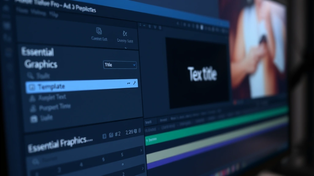
To create your first text layer using the Essential Graphics panel, begin by opening the panel from the Window menu. Locate and click on the Essential Graphics option, which will display a panel typically positioned on the right side of your workspace. This panel contains pre-designed templates, text formatting options, and graphic elements that you can customize.
Start by selecting a text template from the available options or create a new text element by clicking the text icon within the panel. Once you’ve initiated text creation, your cursor will activate on the video canvas, allowing you to type directly into your project. The text will appear in the default font and size, which you can modify using the formatting controls in the Essential Graphics panel.
Positioning your text requires clicking and dragging the text element on the canvas until it occupies your desired location. You can also use the position fields in the Essential Graphics panel to input precise coordinates if you need pixel-perfect placement. This precision becomes crucial when creating professional-looking projects where text alignment and spacing contribute significantly to visual hierarchy.
The Essential Graphics panel provides immediate feedback on your text appearance, showing exactly how your text will render in the final video. This real-time preview eliminates guesswork and allows you to make adjustments before committing to your edits. Once satisfied with your text placement and basic properties, you can proceed to more advanced formatting options.
Key steps for text layer creation:
- Open the Essential Graphics panel from the Window menu
- Select a text template or create new text
- Click on the video canvas where you want text to appear
- Type your desired text content
- Adjust position by dragging or using position coordinates
- Modify size and basic formatting in the panel
Formatting and Styling Text
Once your text layer exists, formatting becomes your next priority. The Essential Graphics panel offers extensive customization options for typography, color, and effects. Access the text properties section to modify font selection, size, weight, and style. Premiere Pro provides access to system fonts installed on your computer, giving you thousands of options for creative expression.
Color selection in Premiere Pro allows you to choose from a color picker or input specific color values using RGB, HSL, or hex codes. This flexibility ensures your text maintains proper contrast against your video background, which is essential for readability and professional appearance. The opacity slider lets you create semi-transparent text that allows background elements to show through while maintaining text legibility.
Text alignment options include left, center, and right alignment, with additional controls for vertical positioning. Leading adjusts the space between text lines, while tracking controls the overall spacing between characters. These subtle adjustments significantly impact how professional your text appears and how easily viewers can read your content.
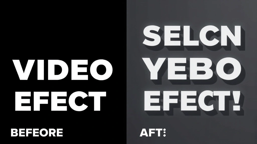
Shadow and outline effects add depth and dimension to your text, helping it stand out against busy backgrounds. You can customize shadow color, opacity, distance, and angle to create the exact effect you envision. Outline thickness and color provide additional contrast, particularly useful when text overlays complex or high-contrast video backgrounds where readability might otherwise suffer.
The stroke option allows you to add a colored border around your text characters, enhancing visibility and creating stylistic effects. By combining shadow, outline, and stroke options thoughtfully, you create text that remains readable regardless of background content while maintaining aesthetic appeal aligned with your project’s visual style.
Using Essential Graphics Panel
The Essential Graphics panel represents the modern standard for text creation in Premiere Pro, offering a comprehensive workspace dedicated to graphic and text design. This panel integrates motion graphics templates (MOGRTs) that provide pre-designed, professional-quality text treatments requiring minimal customization. These templates save significant time when you need polished results quickly.
Browse the template library by category, including lower thirds, titles, callouts, and animated text. Each template includes customizable elements where you can change text content, colors, and sometimes size parameters. Templates often include built-in animations that trigger when you add them to your timeline, eliminating the need to manually create complex motion graphics from scratch.
The panel’s design workspace allows you to edit templates directly, adjusting colors, fonts, and layout to match your project’s visual identity. Creating custom templates from your text elements enables consistency across multiple projects. Once you’ve designed a text treatment you particularly like, save it as a template for future use, dramatically accelerating your workflow on subsequent projects.
Responsive design features in the Essential Graphics panel automatically adjust text size and positioning based on your sequence settings, ensuring your text remains properly proportioned whether you’re working in 1080p, 4K, or other aspect ratios. This automation prevents the tedious task of manually adjusting text for different delivery formats, a consideration that becomes increasingly important when your work needs to adapt to multiple platforms.
The Essential Graphics panel also includes graphic elements like shapes, lines, and backgrounds that complement your text. Adding a subtle background shape behind your text improves readability and creates visual separation from your video content. These graphic elements can be animated alongside your text to create cohesive, professional-looking title sequences.
Adding Text Animation and Effects
Static text serves its purpose, but animated text captures attention and guides viewer focus through your narrative. Premiere Pro provides animation options directly within the Essential Graphics panel or through the Effects panel for more advanced motion control. The simplest animations include fade-in and fade-out effects that make text appear and disappear smoothly.
To apply animations, select your text layer on the timeline and access the animation options in the Essential Graphics panel. Choose from preset animations including slide, scale, rotate, and opacity changes. These animations occur over a duration you specify, typically measured in frames or seconds. Staggering multiple text elements with slightly different animation timings creates visual rhythm and maintains viewer engagement.
Advanced animators in Premiere Pro allow you to create custom motion paths where text moves across the screen following a trajectory you define. This technique works particularly well for directional emphasis or when text needs to follow action occurring in your video. You can animate text properties individually—moving text while simultaneously rotating and changing its opacity for complex, sophisticated effects.
The Motion tab in the Effect Controls panel provides precise control over position, scale, rotation, and opacity with keyframe-based animation. Setting keyframes at different points on your timeline creates smooth transitions between values. This approach gives you pixel-perfect control over every aspect of your text’s motion and appearance throughout its duration on screen.
Color animation allows text to change colors over time, useful for highlighting transitions or creating emphasis at critical moments. Combine color changes with scale animations to make text grow and change color simultaneously, creating dynamic, eye-catching effects. However, remember that excessive animation can distract from your content—use effects purposefully to enhance rather than overwhelm your message.
Common text animation techniques:
- Fade in/out for smooth appearance and disappearance
- Slide animations for directional entrance and exit
- Scale animations for emphasis and dynamic movement
- Rotation for stylistic effects and creative transitions
- Color changes to highlight important moments
- Combination animations for sophisticated results
Working with Legacy Titles
For those using older Premiere Pro versions or preferring the legacy title creation system, the Title panel offers a comprehensive alternative to the Essential Graphics panel. Access this panel through the Window menu, selecting Title. This approach launches the legacy titler, a dedicated workspace for creating and editing titles with extensive customization options.
The Title panel provides a canvas where you draw text boxes and type directly into them. This method offers intuitive positioning since you’re working within a visual representation of your video frame. The Title menu includes options for creating rolling credits, which automatically scroll text up the screen—essential for end credits in longer projects.
Legacy titles can include shapes, images, and various design elements beyond simple text. The text formatting options rival the Essential Graphics panel, offering font selection, size adjustment, color customization, and effects like shadow and outline. Many editors prefer the legacy system for specific tasks, particularly when creating complex credit sequences or specialized title designs.
One consideration when using legacy titles involves forward compatibility. Adobe has gradually shifted focus toward the Essential Graphics panel, meaning legacy titles may not update as seamlessly in future software versions. However, for current projects, legacy titles function perfectly and offer a different workflow that some editors find more intuitive.
Converting between legacy titles and Essential Graphics can be necessary when collaborating with others or updating projects created in earlier software versions. Premiere Pro provides options to export legacy titles and import them into the Essential Graphics workflow, though some formatting adjustments may be necessary during the conversion process.
Best Practices for Text in Video
Creating readable, professional-looking text in video requires understanding fundamental principles that extend beyond simple software operation. Contrast represents your primary concern—text must be legible against whatever background it overlays. Avoid placing light text on light backgrounds or dark text on dark backgrounds. When your video background is unpredictable, using a semi-transparent background shape or outline behind text ensures readability regardless of what appears behind it.
Font selection significantly impacts both readability and professionalism. Sans-serif fonts like Arial, Helvetica, and Open Sans work well for on-screen text, offering clarity and modern appearance. Avoid overly decorative or script fonts that sacrifice legibility for style. When you need distinctive typography, use decorative fonts sparingly for headlines while reserving simple, readable fonts for body text or information-heavy content.
Text size must accommodate your viewing distance and platform. Content destined for social media, where viewers watch on small phone screens, requires larger text than content for theatrical projection. As a general guideline, text should occupy no more than about one-third of your video frame width, with minimum font sizes around 24-30 points for standard video delivery. Always preview your text on the actual display device when possible.
Duration matters significantly—viewers need adequate time to read your text before it disappears. A basic rule suggests allowing approximately one second per five words, though complex or technical information requires longer display times. Animated entrance and exit effects add to the total time text occupies the screen, so account for animation duration when calculating how long text remains visible.
Consistency in text styling throughout your project creates professional cohesion. Establish a limited palette of fonts, colors, and effects that you use repeatedly. This approach prevents your video from appearing chaotic or amateurish while establishing visual identity similar to how branding guidelines work in DIY woodworking projects where consistent finishing techniques improve overall quality.
Placement strategy involves understanding compositional principles. The rule of thirds suggests positioning important text elements along the grid lines where vertical and horizontal thirds intersect. Avoid centering all text, which can feel static and uninspired. Instead, vary text position throughout your sequence while maintaining overall balance and visual hierarchy.
Safety margins, typically a 10% border around your video frame, should contain all essential text. Some television displays overscan, cutting off content near the edges. By keeping text within safety margins, you ensure visibility on all playback systems. This consideration becomes particularly important when creating content for broadcast or professional distribution through comprehensive editing resources.
Color psychology influences how viewers perceive your message. Warm colors like red and orange convey energy and urgency, while cool colors like blue and green suggest calm and professionalism. Choose text colors that reinforce your message’s emotional tone while maintaining adequate contrast for readability. Test your color choices on multiple displays, as color perception varies significantly across different screen types and calibrations.
FAQ
What’s the difference between Essential Graphics and Legacy Titles?
Essential Graphics represents Premiere Pro’s modern text creation system with better template support and responsive design features. Legacy Titles offer a dedicated workspace some editors prefer, though Adobe focuses development efforts on Essential Graphics. Both methods produce quality results; choose based on your workflow preference and project requirements.
Can I animate text in Premiere Pro?
Yes, extensively. The Essential Graphics panel includes preset animations, while the Effects panel and Motion tab provide advanced keyframe-based animation control. You can animate position, scale, rotation, opacity, color, and virtually any text property to create dynamic, engaging text effects.
How do I make text readable over busy video backgrounds?
Use contrast techniques including semi-transparent background shapes, text outlines, shadows, or strokes. Limit text size and duration to ensure viewers can read it quickly. Test your text on the actual playback device when possible, as screen characteristics affect readability.
What font sizes work best for video text?
Minimum 24-30 points for standard video, though larger sizes work better for mobile viewing. Consider your distribution platform—social media content needs larger text than theatrical projection. Always preview on target displays to verify readability.
How long should text remain on screen?
Allow approximately one second per five words as a baseline. Complex information requires longer display times. Account for animation duration when calculating total text visibility time. Always give viewers sufficient time to read without rushing through your content.
Can I use custom fonts in Premiere Pro?
Yes, any font installed on your system is available. Install additional fonts through your operating system’s font management system. Be mindful of licensing when using custom fonts in professional or commercial projects—verify that your license permits video distribution.
How do I create rolling credits?
Use the Title panel’s rolling credits feature for automated credit sequences. Input your credit information, and the system automatically formats and animates the scroll. The Essential Graphics panel doesn’t include rolling credits, so use the legacy Title system for this specific task.
What’s the best way to add lower thirds to my video?
The Essential Graphics panel includes lower third templates designed specifically for this purpose. Browse available templates, customize the text and colors to match your project, and apply to your timeline. Templates often include animations that trigger automatically, saving time compared to building lower thirds from scratch.