
Secondary Axis in Excel: Expert Tips Explained
Excel’s secondary axis feature is a powerful tool that allows you to display multiple data series with different scales on a single chart. When you have data that varies dramatically in magnitude or uses different units of measurement, a secondary axis becomes essential for creating meaningful visualizations. This capability transforms confusing, hard-to-read charts into clear, professional presentations that accurately represent your data relationships.
Whether you’re tracking sales alongside market growth percentages, comparing temperature changes with humidity levels, or analyzing financial metrics across different time periods, understanding how to implement a secondary axis will elevate your data visualization skills. In this comprehensive guide, we’ll walk you through the process step-by-step, explore advanced techniques, and share professional tips that will make your Excel charts more impactful and easier to interpret.
What Is a Secondary Axis and Why You Need It
A secondary axis is an additional vertical (Y) or horizontal (X) axis that runs parallel to your primary axis. It serves as a reference scale for specific data series within your chart, allowing you to plot data with completely different ranges or units on the same visual. Without a secondary axis, data points that vary significantly in magnitude can render smaller values nearly invisible on your chart.
Consider a practical example: you’re analyzing monthly sales revenue (ranging from $50,000 to $500,000) alongside customer satisfaction scores (ranging from 1 to 10). If you plot both on the same scale, the satisfaction scores become invisible dots at the bottom of your chart. A secondary axis solves this problem by creating two independent scales, one for each data series.
The benefits of using a secondary axis include improved data clarity, the ability to compare metrics with different units, professional-looking charts that tell a complete story, and easier identification of correlations between disparate datasets. When creating DIY project documentation or reports, secondary axes help stakeholders quickly grasp complex relationships in your data.
Step-by-Step Guide to Adding a Secondary Axis
Method 1: Using the Chart Design Ribbon (Recommended)
First, create your basic chart with all your data series included. Select the chart by clicking on it once. You’ll notice the Chart Design and Format tabs appear in your ribbon menu. Click on Chart Design, then locate the Change Chart Type button. In the dialog that opens, select the chart type you prefer—typically a combination chart works best when mixing different data types.
Next, identify which data series should use the secondary axis. Right-click directly on that specific data series (the line, bars, or points representing that series). From the context menu, select “Format Data Series.” In the panel that appears, navigate to the Series Options section and change the “Plot Series On” dropdown from “Primary Axis” to “Secondary Axis.” Click Close, and your secondary axis will automatically appear on the right side of your chart.
Method 2: Using the Format Panel
An alternative approach involves selecting your chart and accessing the Format menu. Click on the data series you want to move to a secondary axis. In the Format panel on the right side of your screen, expand the Series Options section. You’ll find a dropdown menu labeled “Plot Series On”—change this to Secondary Axis. This method is particularly useful when working with complex Excel spreadsheets requiring multiple data visualizations.
Important Considerations During Setup
Before adding your secondary axis, ensure your primary data series are already selected in your chart. Excel needs to understand which series form your baseline. Also, verify that you’re working with a chart type that supports secondary axes—combination charts, scatter plots, and line charts work best. Bar charts can support secondary axes, but the visualization may appear cluttered.
Always check your data ranges before creating the chart. Incomplete data ranges can cause Excel to exclude series you intended to include. Additionally, consider whether your data actually needs two axes—if the ranges are similar enough, a single axis with adjusted scaling might be clearer.
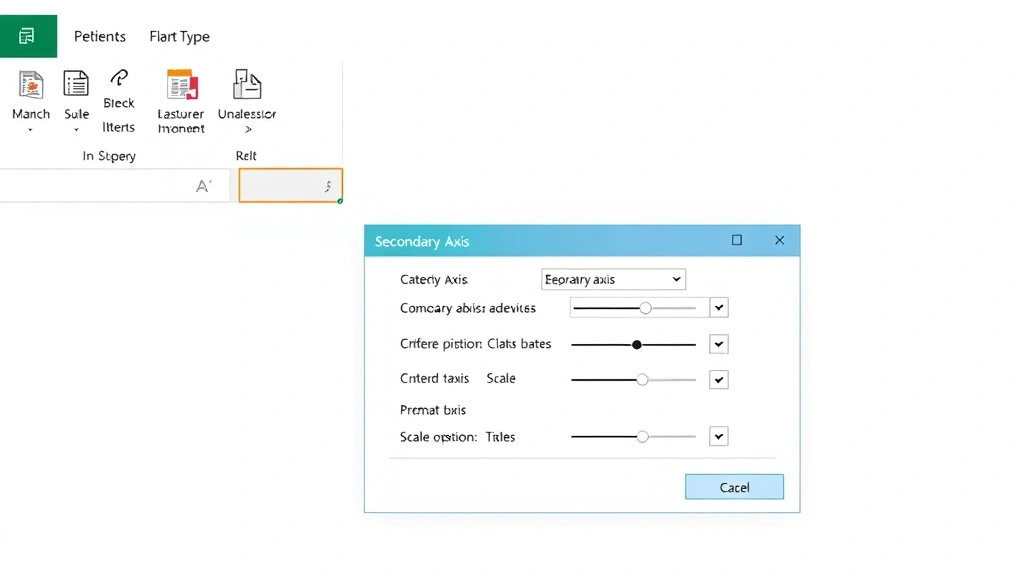
Formatting Your Secondary Axis
Once your secondary axis exists, formatting it properly ensures your chart remains readable and professional. Start by double-clicking the secondary axis itself (the numbers on the right side of your chart). The Format Axis panel opens, giving you extensive customization options.
Adjusting Axis Scale
The most critical formatting task involves setting appropriate minimum and maximum values for your secondary axis. Click the Axis Options section and toggle “Auto” off for both Minimum and Maximum values. Enter custom values that make sense for your data. If your secondary data ranges from 5 to 95, set the minimum to 0 and maximum to 100 for cleaner presentation. This prevents Excel from creating awkward scales that confuse readers.
Consider the relationship between your primary and secondary axis scales. If you’re comparing two metrics that should appear proportional, adjust the scales so that similar growth rates appear visually similar. This prevents misleading visual representations where one axis scale exaggerates minor fluctuations while another compresses significant changes.
Axis Labels and Titles
Add descriptive labels to both axes. Right-click your secondary axis and select “Add Axis Title.” Choose “Rotated Title” for the right-side axis. Enter a clear label like “Customer Satisfaction Score” or “Market Share Percentage” so viewers immediately understand what the secondary axis represents. Use units in your labels when applicable (“Revenue ($)”, “Temperature (°F)”).
For the primary axis, repeat this process to ensure both axes are clearly labeled. This is critical for accessibility and professional presentation. Your chart should be understandable without requiring viewers to reference accompanying documentation.
Color Coding for Clarity
Assign distinct colors to your data series and their corresponding axes. If your primary axis data is blue, make the primary axis text and numbers blue as well. Apply the same color to your secondary axis data series and its axis labels. This color-coding system helps viewers instantly understand which scale applies to which data.

Common Mistakes to Avoid
Mistake 1: Inappropriate Scale Relationships
One frequent error involves creating secondary axis scales that distort data relationships. If your primary axis ranges from 0-1000 and your secondary axis ranges from 0-10, a value of 500 on the primary axis and 5 on the secondary axis appear visually equivalent, even if they represent completely different proportional changes. Always verify that your scale relationships accurately represent your data’s true relationships.
Mistake 2: Overcrowding Your Chart
While secondary axes solve the visibility problem, including too many data series creates visual confusion. Limit yourself to 2-3 data series maximum when using a secondary axis. If you need to display more data, consider creating separate charts or using a dashboard layout. Viewers should grasp your main message within seconds of looking at your chart.
Mistake 3: Forgetting Legend Updates
After adding a secondary axis, your legend may become confusing. Right-click your legend and select “Edit Legend Entries” to ensure each series is clearly labeled. Consider adding parenthetical notes like “(Primary Axis)” and “(Secondary Axis)” to prevent misinterpretation.
Mistake 4: Neglecting Axis Titles
Charts without axis titles force viewers to guess what your data represents. This is particularly problematic with secondary axes where the context isn’t immediately obvious. Always include clear, descriptive axis titles. When sharing your work across team communication platforms like Outlook, properly labeled charts prevent confusion and questions.
Mistake 5: Using Incompatible Chart Types
Not all chart types support secondary axes effectively. Pie charts cannot use secondary axes. 3D charts often display secondary axes poorly. Stick with combination charts, line charts, scatter plots, and area charts for best results with secondary axes.
Advanced Techniques and Best Practices
Creating Dual-Axis Combination Charts
For maximum impact, combine different chart types on a single chart with a secondary axis. Display your primary data as bars and secondary data as a line. This visual distinction helps viewers quickly identify which scale applies to which data. To achieve this, create your chart with the primary data as bars, then right-click your secondary axis data series and change its chart type to Line. Select “Marker” or “Line Marker” options for clarity.
This technique works exceptionally well when comparing cumulative totals (displayed as bars) with percentage changes (displayed as a line). The visual distinction reinforces the conceptual difference between the two metrics.
Using Data Labels Effectively
Add data labels to your series, especially when using a secondary axis. Right-click your data series and select “Add Data Labels.” This approach provides exact values for viewers, preventing misinterpretation caused by reading values from different scales. When space permits, display both the value and the series name.
Implementing Gridlines Strategically
Gridlines help viewers read values from your axes, but they can clutter charts with secondary axes. Right-click your chart background and select “Format Plot Area.” Under Gridlines, enable only horizontal gridlines (or vertical, depending on your chart orientation). Disable secondary axis gridlines if they create visual confusion. You want gridlines to aid readability, not hinder it.
Professional Tips from Industry Standards
According to Microsoft Excel documentation, secondary axes should only be used when data cannot be meaningfully displayed on a single scale. The Tableau guide on dual-axis charts recommends limiting secondary axes to situations where you’re comparing metrics with fundamentally different units or ranges. This ensures your visualization remains truthful and unbiased.
When building dashboards or reports, consider whether data visualization best practices support your secondary axis choice. Some designers argue that separate charts side-by-side provide clearer comparison than a single chart with multiple axes. Test both approaches with your audience to determine which communicates most effectively.
Exporting and Sharing Charts with Secondary Axes
When exporting your chart to PowerPoint, Word, or PDF, verify that the secondary axis remains visible and properly formatted. Right-click your chart and select “Save as Picture” to ensure consistent appearance across platforms. If sharing digitally, provide both the Excel file and exported image versions to accommodate different viewing contexts.
For presentations, consider adding a brief explanation of your secondary axis in speaker notes or accompanying text. Not all audience members immediately understand secondary axes, so a simple statement like “The blue bars show revenue on the left axis, while the orange line shows customer satisfaction on the right axis” prevents confusion.
Frequently Asked Questions
Can I add a secondary axis to a pie chart?
No, pie charts cannot display secondary axes. Pie charts represent parts of a whole and don’t use traditional X and Y axes. If you need to compare two metrics where one is a pie chart, create separate charts and arrange them side-by-side in your presentation.
What’s the difference between a secondary Y-axis and a secondary X-axis?
Secondary Y-axes (vertical) are most common and useful for comparing metrics with different ranges. Secondary X-axes (horizontal) are less frequently used but can help when comparing time periods or categories with different scales. Most secondary axis applications involve Y-axes.
How do I remove a secondary axis after adding it?
Right-click the secondary axis and select “Delete.” Alternatively, select your data series that’s plotted on the secondary axis, right-click it, choose “Format Data Series,” and change the “Plot Series On” setting back to “Primary Axis.” The secondary axis will disappear if no data series use it.
Can I have more than one secondary axis?
Standard Excel charts support only one secondary axis per chart. If you need to display more than three data series with different scales, consider creating a combination of multiple charts or using a dashboard layout with separate visualizations for each metric.
Why does my secondary axis appear on the left instead of the right?
This typically occurs with certain chart configurations or when Excel’s default settings are overridden. Right-click the secondary axis and select “Format Axis.” Under Axis Position, ensure “Right” is selected for Y-axes. The secondary axis should display on the opposite side from your primary axis.
How do I ensure my secondary axis scale accurately represents my data?
Calculate the ratio between your largest and smallest values for each dataset. Set your axis scales proportionally. If one dataset ranges from 0-100 and another from 0-1000, the visual representation of growth should be similar if both represent equivalent percentage changes. Use the Axis Options to manually set minimum and maximum values that reflect this relationship.
Should I always use a secondary axis when comparing different units?
Not necessarily. If one metric is clearly subordinate to another or if space allows separate charts, that might be preferable. Use secondary axes when you want to emphasize the relationship between two metrics and when they genuinely need to be viewed together for proper context and interpretation.