
How to Alternate Row Colors in Excel: Expert Tips for Better Data Visualization
Managing large datasets in Excel can be overwhelming, especially when you’re trying to track information across multiple rows and columns. One of the most effective ways to improve readability and reduce errors is by alternating row colors. This simple yet powerful formatting technique helps your eyes follow data more easily and makes your spreadsheets look more professional. Whether you’re creating a budget tracker, inventory list, or project schedule, mastering alternating row colors will transform how you present information.
Alternating row colors isn’t just about aesthetics—it’s a practical solution for data accuracy and user experience. When rows are visually separated by color, it becomes significantly easier to read across columns without losing your place. This is especially important when working with complex spreadsheets that contain dozens of columns or hundreds of rows. In this guide, we’ll walk you through multiple methods to achieve this effect, from simple manual formatting to advanced automated approaches.
Understanding the Basics of Row Color Alternation
Before diving into the technical steps, it’s important to understand why alternating row colors matters and when to implement this formatting. The concept is rooted in data visualization principles that help reduce cognitive load. When you’re scanning a spreadsheet with alternating colors, your brain processes the information more efficiently because each color acts as a visual boundary.
There are several scenarios where alternating row colors become essential. If you’re managing a home renovation budget, alternating colors help you track expenses across categories. When organizing project materials and costs, this formatting prevents you from misreading quantities or prices. The technique also works well for any spreadsheet shared with team members, as it demonstrates professionalism and attention to detail.
Excel offers multiple built-in tools specifically designed for this purpose, each with different advantages depending on your needs. Some methods work better for static data, while others automatically adjust when you add new rows. Understanding these differences will help you choose the right approach for your specific situation.
Method 1: Manual Formatting for Small Datasets
For spreadsheets with a limited number of rows—typically fewer than 50—manual formatting is straightforward and gives you complete control over appearance. This method involves selecting individual rows and applying background colors manually through Excel’s formatting toolbar.
Step-by-step process:
- Select the first row of data you want to format (click on the row number on the left side to select the entire row)
- Right-click and choose “Format Cells” or use the Format menu
- Navigate to the “Fill” tab and select your desired background color
- Click OK to apply the formatting
- Repeat this process for every other row, alternating between your chosen colors
- For consistency, use the Format Painter tool (brush icon) to copy formatting between identical rows
While this method works for small datasets, it becomes time-consuming and error-prone with larger spreadsheets. However, it’s useful when you need complete creative control or when working with irregularly structured data that doesn’t fit standard formatting patterns. The advantage is that you can apply different colors to highlight important rows or create custom visual hierarchies based on data importance.
Pro tip: Create a color palette before you start. Choose two colors that have sufficient contrast for accessibility—avoid light colors on light backgrounds or dark on dark. According to WCAG accessibility guidelines, maintain at least a 4.5:1 contrast ratio for readability.
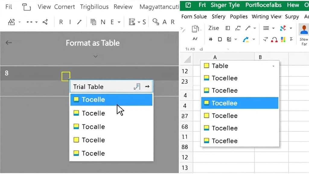
Method 2: Using Format as Table Feature
The “Format as Table” feature is Excel’s most efficient built-in solution for alternating row colors. This method automatically applies professional formatting and updates dynamically when you add or remove rows. It’s the recommended approach for most users because it combines simplicity with automatic updates.
How to use Format as Table:
- Select any cell within your data range
- Go to the “Home” tab on the ribbon
- Click “Format as Table” in the Styles group
- Choose from the pre-designed table styles—many include alternating row colors
- Confirm the data range in the dialog box that appears
- Click OK to apply the formatting
What makes this method particularly powerful is that Excel automatically recognizes your data structure. When you add new rows to the bottom of your table, the alternating color pattern continues seamlessly. The feature also adds filter buttons to your headers, making it easier to sort and organize your data.
You can further customize the table style by right-clicking on it and selecting “Table Design” options. This allows you to modify colors, toggle header rows on or off, and adjust the banding pattern. For home security planning spreadsheets or woodworking project lists, this feature provides immediate professional appearance with minimal effort.
One consideration: once you apply “Format as Table,” Excel treats your data as a structured table with specific rules. If you need to work with individual cells outside these rules, you may need to convert the table back to a regular range first.
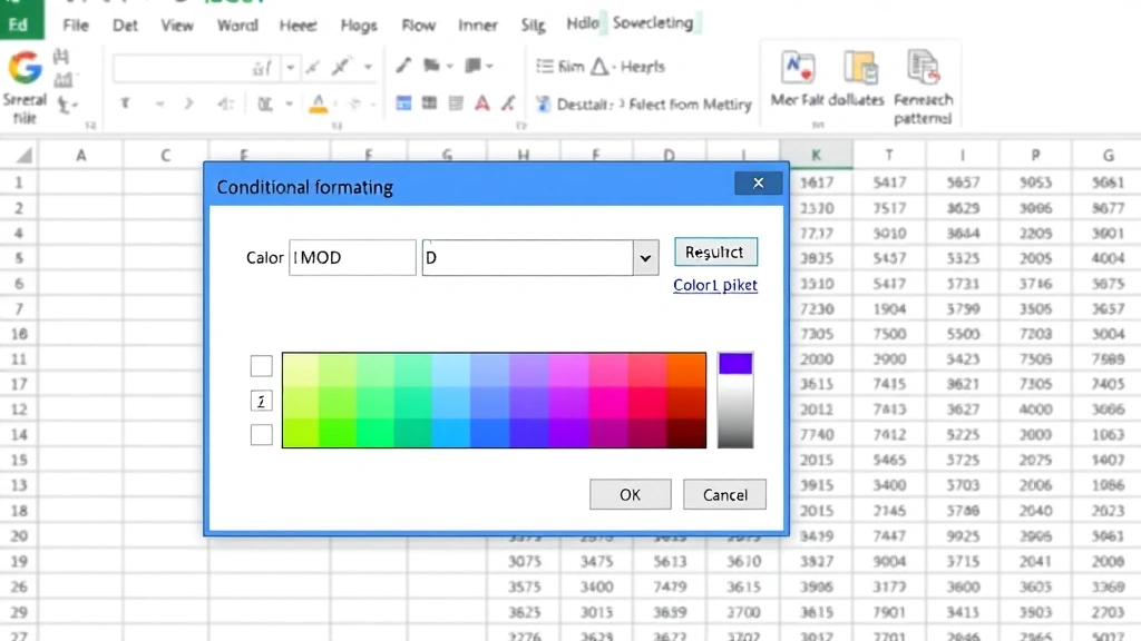
Method 3: Conditional Formatting with Formulas
For advanced users who need more flexibility and control, conditional formatting with formulas offers powerful customization options. This method uses Excel’s conditional formatting engine to apply colors based on specific conditions, including row numbers.
Setting up conditional formatting:
- Select the entire range of cells you want to format (for example, A1:Z1000)
- Go to the “Home” tab and click “Conditional Formatting”
- Choose “New Rule” and select “Use a formula to determine which cells to format”
- Enter the formula: =MOD(ROW(),2)=0 (this formats even-numbered rows) or =MOD(ROW(),2)=1 (for odd-numbered rows)
- Click the “Format” button and choose your background color
- Click OK twice to apply the formatting
- Repeat steps 2-6 with the alternate formula to add the second color
The MOD function is the key here. MOD(ROW(),2) divides the row number by 2 and returns the remainder. If the remainder is 0, the row is even; if it’s 1, the row is odd. This formula automatically adjusts for every row in your range, making it scalable to thousands of rows.
Conditional formatting is particularly useful when you need to apply different formatting rules simultaneously. For instance, you could alternate row colors AND highlight cells that exceed a certain value, or format rows based on date criteria. This layered approach works well for comprehensive DIY project tracking where you need multiple visual indicators.
The advantage of this method is that it automatically updates when you insert or delete rows within your formatted range. However, if you insert rows above your range, you may need to adjust your formula references.
Method 4: Advanced Formatting Techniques
Once you’ve mastered the basic methods, you can explore advanced techniques that combine multiple formatting approaches for sophisticated spreadsheets. These methods are ideal for complex data analysis or professional reporting.
Combining conditional formatting with multiple criteria:
You can create formulas that alternate colors based on multiple conditions. For example, if you’re tracking maintenance schedules, you might alternate row colors while also highlighting overdue items in red. The formula would look like: =AND(MOD(ROW(),2)=0, A1
This combines the MOD function for alternation with an AND function to check if the date in column A is overdue. This creates a powerful visual system where users immediately see both the data structure and critical information.
Using VBA macros for custom automation:
For users comfortable with programming, Visual Basic for Applications (VBA) allows you to create custom macros that apply alternating colors with specific rules. You can automate the process so that simply pressing a button applies your preferred formatting to any selected range. This is particularly useful if you work with multiple spreadsheets regularly and want consistency across all documents.
The macro can also include additional features like automatic column width adjustment, header formatting, and number formatting—all in one automated step. While this requires more technical knowledge, it significantly increases efficiency for power users.
Creating dynamic color schemes with data-driven formatting:
Advanced users can create formatting that changes based on the actual data values. For instance, you might alternate colors while simultaneously varying the shade intensity based on a numerical column. A project with high costs might display in darker shades of your chosen color, while low-cost projects appear in lighter shades. This creates a visual representation of data patterns while maintaining the alternating row structure.
Best Practices for Color Selection and Implementation
Choosing the right colors for alternating rows goes beyond aesthetics—it impacts readability, accessibility, and professional appearance. Here are essential best practices to follow.
Contrast and accessibility:
Always maintain sufficient contrast between your row colors and text. According to Section 508 accessibility standards, all text should be readable without color alone being the distinguishing factor. Use a contrast ratio checker tool to verify your color choices meet accessibility standards before finalizing your spreadsheet.
Avoid relying solely on color to convey information, as colorblind users may not perceive the distinction. If color is important for data meaning, combine it with other visual indicators like patterns, icons, or text formatting.
Professional color combinations:
Common effective combinations include light gray alternating with white, light blue with white, or light green with white. These combinations provide visual separation without being distracting. Avoid bright, saturated colors that can cause eye strain during extended viewing. Professional spreadsheets typically use subtle, muted tones.
Consider your audience and context. Financial spreadsheets benefit from conservative color schemes, while creative projects might use bolder colors. Consistency with your organization’s branding guidelines also matters if this spreadsheet will be shared or presented to others.
Maintaining readability across columns:
When you have many columns, alternating row colors become even more important. However, ensure your column headers are distinct from the data rows. Make headers bold, use a darker background, or increase font size to create visual hierarchy. This prevents confusion between header information and data.
Test your formatting by printing a sample page or exporting to PDF. Sometimes colors appear different in printed form, and you may need to adjust your selections to maintain readability in all formats.
Consistency across related spreadsheets:
If you maintain multiple spreadsheets for related projects (such as different phases of a home renovation), use consistent color schemes across all documents. This helps users navigate between files more easily and creates a cohesive appearance in your documentation.
Document your color choices and formatting rules in a template file that you can reuse. This ensures consistency and saves time when creating new spreadsheets. Most organizations benefit from having a standard template with pre-applied formatting that team members can use as a starting point.
Frequently Asked Questions
Can I alternate row colors in Excel Online?
Yes, Excel Online supports the “Format as Table” feature and basic conditional formatting. However, some advanced features like VBA macros are not available. The Format as Table method works identically in the web version, making it the best choice for cloud-based collaboration.
How do I remove alternating row colors if I change my mind?
For tables created with “Format as Table,” right-click the table and select “Convert to Range” to remove the table formatting. For conditional formatting, go to Home > Conditional Formatting > Manage Rules, select your rules, and click Delete. For manual formatting, select the rows and choose “No Fill” from the background color options.
Will alternating colors print correctly?
Yes, but always preview your spreadsheet in Print Preview before printing. Colors may appear slightly different in printed form compared to screen display. Test a sample page to ensure readability. If printing in black and white, consider using patterns instead of colors, as colors may appear as shades of gray.
Can I use alternating row colors with filtered data?
Yes, and this is actually where alternating colors become most valuable. When you filter a table, the alternating pattern continues across visible rows, making it easier to read filtered results. Tables created with “Format as Table” handle this automatically.
What’s the best method for very large spreadsheets with thousands of rows?
For large datasets, the conditional formatting method with MOD formulas is most efficient. It applies instantly regardless of row count and automatically adjusts when you add new data. Avoid manual formatting for any spreadsheet with more than 100 rows, as it becomes impractical and error-prone.
Can I create custom alternating patterns beyond simple two-color schemes?
Yes, using conditional formatting with more complex formulas, you can create patterns that repeat every three, four, or more rows. For example, =MOD(ROW(),3)=1 creates a pattern that repeats every three rows. This allows creative color schemes while maintaining the visual separation benefit.