

Add Secondary Axis in Excel: Expert Guide Here!
Working with data in Excel often requires comparing metrics that operate on completely different scales. When you’re trying to visualize sales revenue alongside unit quantities, or temperature variations against humidity levels, a single axis becomes inadequate. This is where the secondary axis feature becomes invaluable for creating professional, multi-dimensional data visualizations that tell the complete story of your information.
Adding a secondary axis in Excel transforms your ability to present complex datasets in a single, cohesive chart. Whether you’re managing project data, financial reports, or performance metrics, understanding how to implement this feature will elevate your spreadsheet skills and data presentation capabilities. This guide walks you through every step, from basic implementation to advanced customization options.
Understanding Secondary Axes in Excel
A secondary axis is an additional vertical or horizontal axis that allows you to plot data series with different scales on the same chart. Imagine you’re analyzing a manufacturing facility’s output: you might want to show total units produced on the primary axis while simultaneously displaying defect rates on a secondary axis. Without a secondary axis, the defect rate data would appear as a flat line because its values (perhaps 0-5%) would be dwarfed by production numbers (perhaps 5,000-50,000 units).
The primary axis is the default axis that appears when you create any chart—typically the left vertical axis for column and bar charts. The secondary axis is an additional axis that provides an independent scale, usually appearing on the right side of column/bar charts or at the top of some chart types. This dual-axis approach enables meaningful comparison between disparate data types without sacrificing visual clarity.
Secondary axes work best when you’re comparing two data series with fundamentally different units or scales. Common scenarios include:
- Revenue (dollars) versus customer count (units)
- Temperature (degrees) versus precipitation (inches)
- Website traffic (page views) versus conversion rate (percentage)
- Production volume (units) versus quality scores (index points)
- Market price (currency) versus trading volume (shares)
Before adding a secondary axis, ensure your data is organized logically with clear headers and consistent formatting. The DIY Nests Hub Blog contains numerous data organization tips that apply to spreadsheet preparation.

Step-by-Step: Adding a Secondary Axis
Method 1: Using the Chart Design Tab (Recommended)
This is the most straightforward approach in modern Excel versions:
- Select your data range including headers (e.g., A1:C12)
- Navigate to the Insert tab and select your desired chart type
- Excel creates your initial chart with all data series on the primary axis
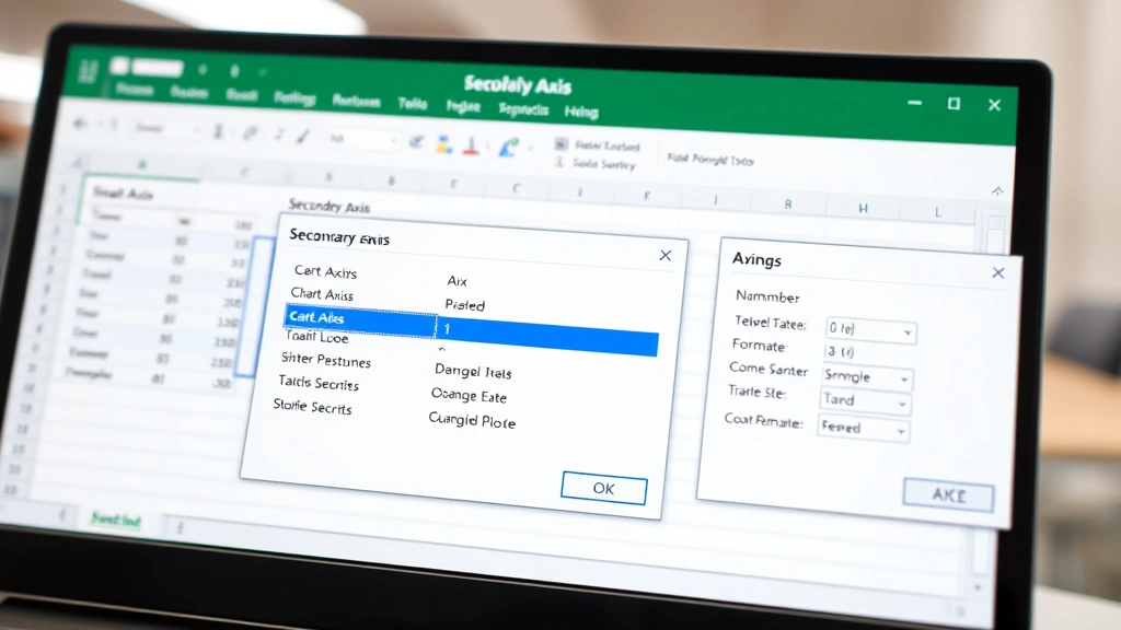
- Right-click on the data series you want to move to a secondary axis
- Choose Format Data Series from the context menu
- In the Format pane, locate Series Options
- Under Plot Series On, select Secondary Axis
- Click elsewhere to apply the changes
Excel automatically generates the secondary axis and adjusts both axis scales appropriately. The secondary axis typically appears on the opposite side of the chart, providing visual balance.
Method 2: Using the Chart Tools Menu
For Excel users preferring menu-based navigation:
- Double-click your chart to enter edit mode (you’ll see a gray border)
- Click on the data series you want to modify
- Navigate to Chart Design → Data → Select Data
- In the Select Data Source dialog, you can reorganize series and modify their axes
- Select your series and choose Edit
- Look for axis assignment options within the series configuration
Method 3: Manual Axis Addition
If you need more control over axis properties:
- Enter chart editing mode by double-clicking the chart
- Right-click directly on your chart background (not on any data)
- Select Add Axis or similar option depending on your Excel version
- Choose Secondary Vertical Axis or Secondary Horizontal Axis
- Then assign your desired data series to this new axis
This method gives you granular control but requires more manual configuration. It’s particularly useful when working with complex data management tasks similar to those handled in productivity applications.
Formatting Your Secondary Axis
Once your secondary axis exists, formatting ensures clarity and professional presentation:
Axis Labels and Titles
Add descriptive labels to distinguish your axes. When editing your chart, right-click the secondary axis and select Format Axis. In the axis title section, add a clear label indicating what the secondary axis represents. For example, if your primary axis shows “Revenue ($)” your secondary axis might display “Customer Count (#)”.
Number Formatting
Ensure each axis displays appropriate number formats. The primary axis might show currency with two decimal places, while the secondary axis displays whole numbers. Access these settings through the Format Axis dialog:
- Right-click the axis
- Select Format Axis
- Choose Number from the left panel
- Select your desired category and formatting options
Color Coordination
Match your data series colors to their corresponding axes for intuitive interpretation. If your revenue data series is blue, make the primary axis text blue. If your customer count is orange, match the secondary axis styling. This visual connection helps viewers immediately understand which data belongs to which axis.
Scale Adjustment
Sometimes Excel’s automatic scaling doesn’t suit your presentation needs. To manually adjust:
- Right-click the axis you want to modify
- Select Format Axis
- In the Axis Options section, adjust:
- Minimum and Maximum values for the axis range
- Major unit for tick mark spacing
- Minor unit for subtle grid divisions
Careful scale adjustment prevents misleading visualizations. An improperly scaled secondary axis can exaggerate or minimize trends artificially.
Common Chart Types and Secondary Axes
Column and Bar Charts
These are the most common chart types for secondary axes. Column charts display data vertically with the secondary axis appearing on the right. Bar charts show data horizontally with the secondary axis at the top. Both work excellently when comparing related but differently-scaled metrics.
Line Charts
Line charts with secondary axes are particularly effective for time-series data. You might display daily sales as a column chart on the primary axis while overlaying weekly trend lines on the secondary axis. This combination reveals both granular fluctuations and broader patterns.
Area Charts
Area charts with secondary axes can show cumulative versus comparative metrics. The filled area of one series might represent total market size (primary axis) while a line on the secondary axis tracks market share percentage.
Combination Charts
Excel’s combination chart feature explicitly supports multiple chart types with secondary axes. You might use columns for actual sales figures and a line for projected sales, each with their own axis. This is particularly useful in visual presentation scenarios where multiple data perspectives enhance understanding.
Avoiding Chart Type Conflicts
Not all chart types support secondary axes effectively. Pie charts, for instance, don’t benefit from secondary axes since they don’t use traditional axes at all. Stick with chart types that use Cartesian coordinates (X and Y axes) for secondary axis implementation.
Troubleshooting Secondary Axis Issues
Secondary Axis Not Appearing
If your secondary axis doesn’t appear after selecting “Secondary Axis,” verify that:
- You’ve selected an actual data series (not just the chart background)
- Your Excel version supports secondary axes (virtually all modern versions do)
- The data series contains numerical values
- You’re not working with an incompatible chart type
Try clicking directly on the data points or line you want to move, then reapply the secondary axis setting.
Axis Labels Overlapping
When both axes have labels, they might overlap, creating visual clutter. Solutions include:
- Reducing font size for axis labels
- Rotating axis text at 45 or 90 degrees
- Abbreviating axis titles
- Increasing chart size to provide more space
Misleading Data Visualization
Improperly scaled axes can distort data relationships. For example, if your primary axis ranges from 0-100 but your secondary axis ranges from 0-1000, small movements in secondary axis data will appear exaggerated. Always verify that your axis scaling represents data relationships accurately and fairly.
Data Series Not Moving to Secondary Axis
If your selection doesn’t seem to take effect:
- Double-click the chart to enter edit mode
- Click the specific data series (you should see selection handles on all data points)
- Right-click and choose Format Data Series
- Explicitly select Secondary Axis in the options
- Click outside the chart to exit edit mode and apply changes
Gridline Confusion
With two axes, gridlines can become confusing. Consider:
- Using different gridline styles for each axis
- Removing minor gridlines if they create visual clutter
- Adjusting gridline colors to match their corresponding axes
Access gridline options by right-clicking on gridlines within the chart or through the Chart Design menu’s gridline options.
FAQ
Can I have more than two axes in a single Excel chart?
Excel’s standard charting functionality supports only one primary and one secondary axis. If you need to compare three or more completely different scales, consider creating separate charts or using alternative visualization tools. Some advanced users create workarounds using hidden data series, but this approach is complex and often creates more confusion than clarity.
What’s the difference between a secondary vertical and secondary horizontal axis?
In column and bar charts, the vertical axis (Y-axis) displays values while the horizontal axis (X-axis) displays categories. A secondary vertical axis provides an additional value scale, while a secondary horizontal axis provides an additional category scale. Most scenarios use secondary vertical axes, but secondary horizontal axes can be useful when comparing multiple categorical dimensions.
How do I remove a secondary axis I no longer need?
To remove a secondary axis, enter chart edit mode, right-click on the secondary axis, and select Delete. However, if data series are assigned to that axis, you’ll need to reassign them to the primary axis first. Select the data series, access Format Data Series, and change from Secondary Axis back to Primary Axis.
Can I use secondary axes in Excel online or Google Sheets?
Excel online supports secondary axes with similar functionality to desktop Excel. Google Sheets also supports secondary axes through its chart editor. The process is slightly different but conceptually identical. In Google Sheets, select your chart, click Chart Editor, navigate to Series, and look for axis assignment options.
What are best practices for secondary axis presentation?
Use secondary axes only when genuinely necessary to compare differently-scaled data. Always label both axes clearly to prevent misinterpretation. Consider your audience’s familiarity with dual-axis charts—they’re powerful but can confuse viewers unfamiliar with their conventions. Match data series colors to their corresponding axes, use consistent number formatting, and avoid artificial scaling that distorts relationships. Remember that clear communication of complex information is always the priority.
How do I make my secondary axis look different from the primary axis?
Format each axis independently through their respective Format Axis dialogs. You can change font sizes, colors, number formats, line styles, and label positions separately. This visual differentiation helps viewers distinguish between the two axes at a glance. However, maintain consistency with your overall chart design and organization color schemes.